Marketing analytics 04 / B2B services / CRO
A Million Blog Sessions That Never Reached a Service Page
A GA4, Hotjar and HubSpot diagnosis of why a high-traffic agency website produced so few qualified leads — and the eight-part conversion roadmap that followed.
- My role
- Project lead and planner
- Period
- Apr 2024 - Sep 2025
- Engagement
- In-house marketing at Golden Owl Solutions
Business objective: Improve the path from educational content to service discovery, enquiry and sales follow-up.
My ownership: I led planning and delivery: translated management objectives into project KPIs and milestones, allocated work and resources, trained and guided contributors, and owned progress against the agreed targets.
B2B technology and service evaluation
Golden Owl’s content attracts people researching software needs. Funnel analysis asks whether that attention reaches service pages, enquiries and a meaningful sales conversation.
Professional work at Golden Owl · Apr 2024–Sep 2025. Multiple marketing activities ran concurrently, so the overall conversion change is not isolated causal evidence.
Golden Owl Solutions ranked well and attracted over a million organic sessions in seven months. Sales did not see a matching increase in qualified enquiries. The task was to locate exactly where the journey broke between a reader arriving on a blog article and a prospect submitting a contact form, using GA4 path exploration, Hotjar heatmaps and HubSpot lead records together.
The website is an excellent publisher and a poor converter. Organic search brings 76.4% of all traffic, but 94.8% of it lands on the blog, and blog readers move to a commercially useful page at a rate of 0.11% or lower — service 0.10%, homepage 0.09%, contact 0.11%, portfolio 0.04%. The blog is not linked into the funnel. Three compounding problems sit on top of that: the homepage has clickable-looking service tiles that carry no links, forms are abandoned after users have already typed their details, and the services menu lists sixteen undifferentiated items. Lead conversion rose from roughly 0.6% to 2.1% during the wider improvement period; the roadmap’s isolated contribution was not measured.
What the evidence says
Where the journey actually broke.
Traffic is real, but it all arrives in one place
Organic search delivers 1,041,476 sessions (76.4% of the total) and direct a further 145,284 (10.7%). Within organic, the blog absorbs 987,856 sessions — 94.8% — while services, portfolio and contact together account for well under half a percent.
Evidence: GA4 traffic by source and page type, 1 Jan – 31 Jul 2025The blog is a dead end, not an entry point
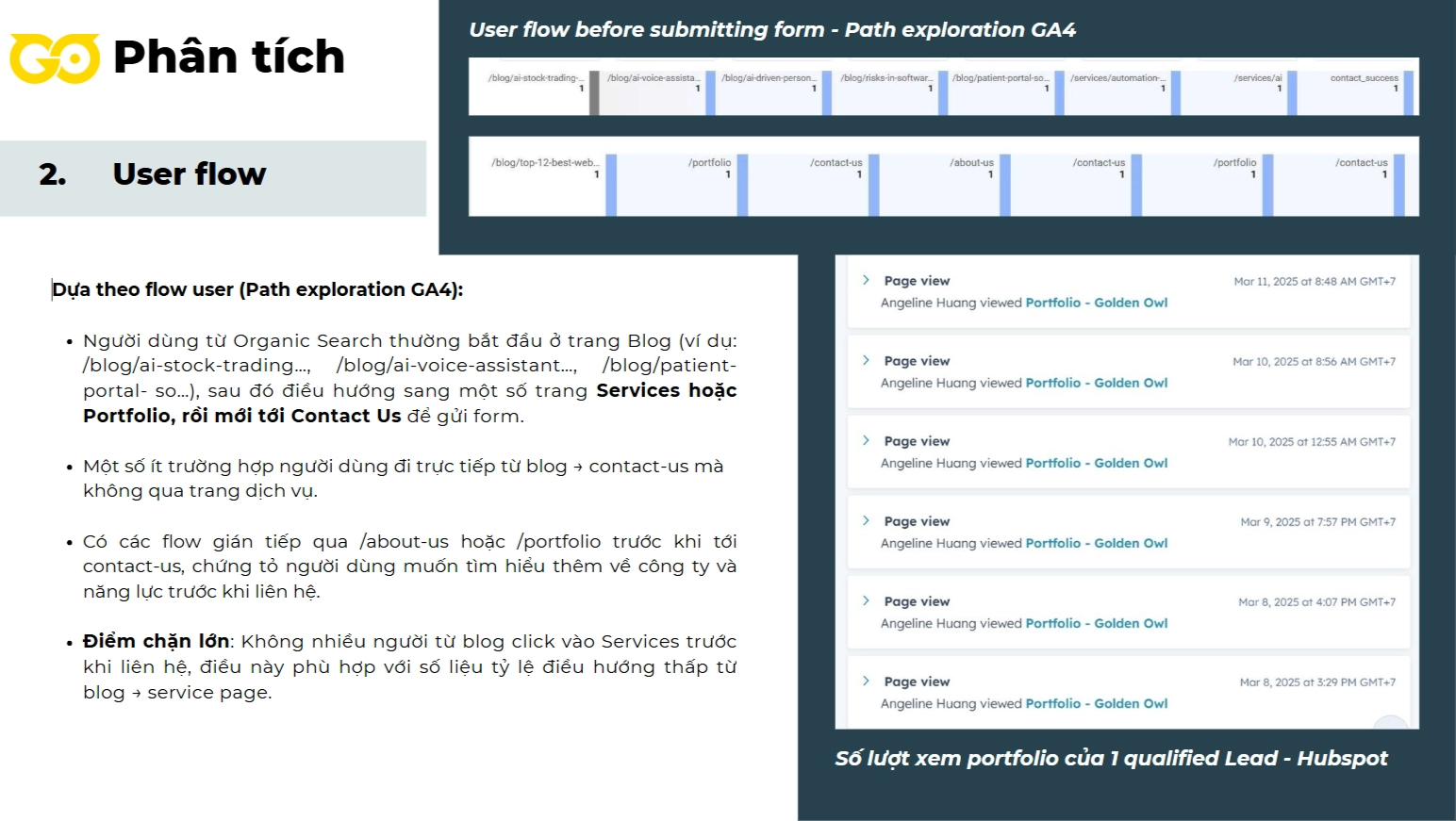
Navigation from blog articles into conversion-capable pages runs at 0.11% or below on every route: contact 1,061 sessions (0.11%), service 990 (0.10%), homepage 898 (0.09%), portfolio 397 (0.04%).
Evidence: blog-to-page-type navigation ratesUsers who reach the form still do not submit it
A GA4 event capturing unsubmitted forms showed users completing name, email, phone and company and then abandoning. That points at friction and trust rather than disinterest — too many fields, no statement of how data is used, and a weak call to action.
Evidence: GA4 collect-unsubmitted-forms eventThe homepage invites clicks it cannot fulfil
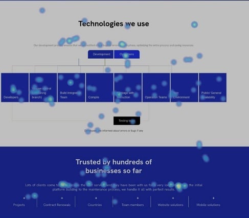
Hotjar heatmaps show heavy clicking on the “comprehensive software solutions” tiles, which carry no links at all. Outside the header and footer, the homepage offers no route into services or portfolio. Scroll data shows the three most engaging sections sit below the point only 40% of users reach.
Evidence: Hotjar click and scroll heatmaps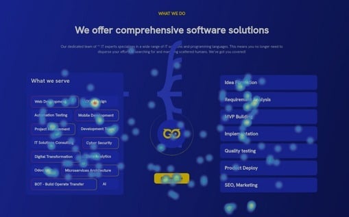
- Restructure the blog sidebar: table of contents and a service banner on the left, a four-field short form with an explicit data-use commitment on the right.
- Place contextual banner CTAs inside articles, positioned by the editorial team to match the subject of each post.
- Replace the low-value “subscribe for blog” block with a service or portfolio banner carrying client logos and a real call to action.
- Add exit-intent popups timed to one third of average engagement time per page group — a form on service pages, a content CTA on the blog.
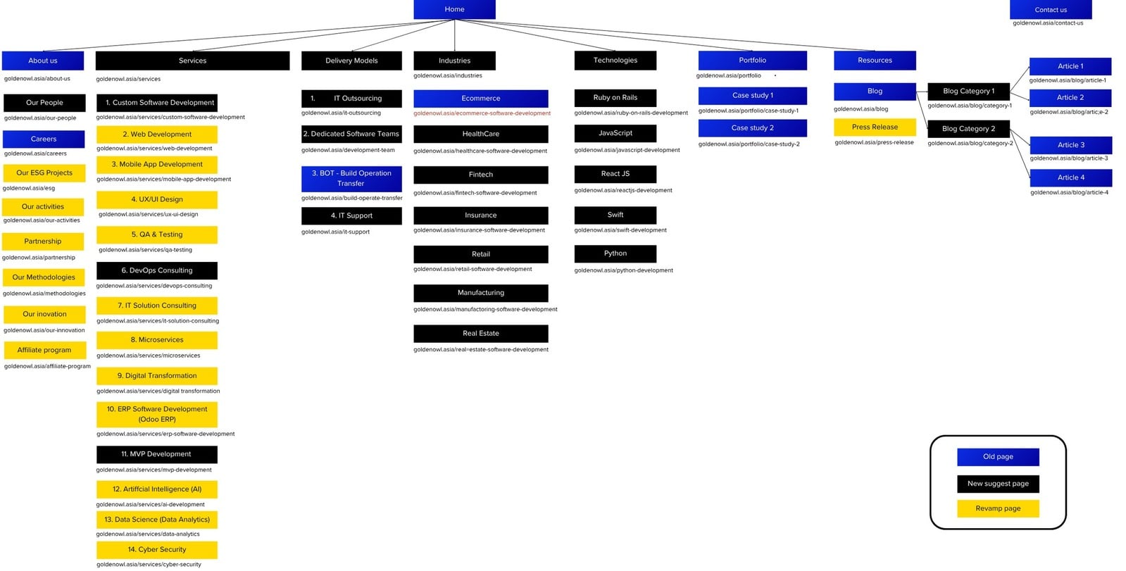
- Regroup the sixteen-item services menu into related clusters and highlight the priority services and portfolio in the header.
- Reduce form fields, state clearly how the data will be used, and strengthen the call to action to recover abandoned submissions.
- Rebuild the portfolio page around two highlighted projects, headline numbers and a two-column grid, and add CTAs, testimonials and related projects to project pages.
- Link the homepage service tiles, and reorder homepage sections so the highest-engagement blocks sit above the 40% scroll line.
- GA4 traffic segmented by source and by page type across a seven-month window.
- Path exploration used to reconstruct the real journey from blog article to contact form, including indirect routes via about-us and portfolio.
- A custom GA4 event deployed to capture form abandonment after fields were populated.
- Hotjar click and scroll heatmaps read against the page structure to find dead clicks and below-the-fold engagement.
- HubSpot records used to check how many portfolio views precede a qualified lead.
- Every recommendation specified with a CMS requirement so the SEO team could A/B test copy and imagery without a developer.
- Conversion improvement reflects the full roadmap plus concurrent marketing activity; no controlled experiment isolates each change.
- Heatmap data is a behavioural sample, not a census of all sessions.
- The original analysis was delivered in Vietnamese; this page is a faithful English summary rather than a literal translation.
- Lead-level screenshots from the source deck are withheld here because they contain personal contact data.